|
|
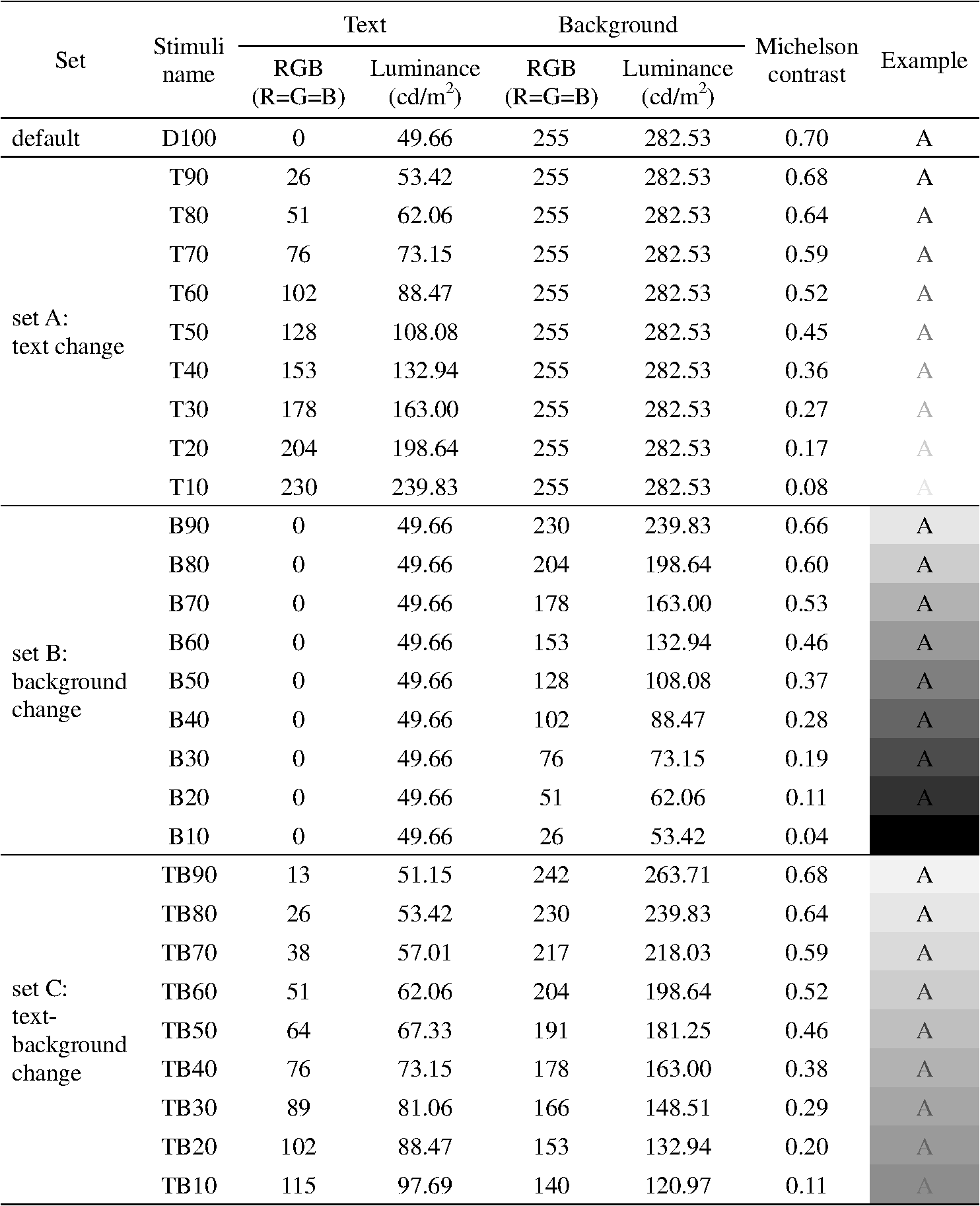
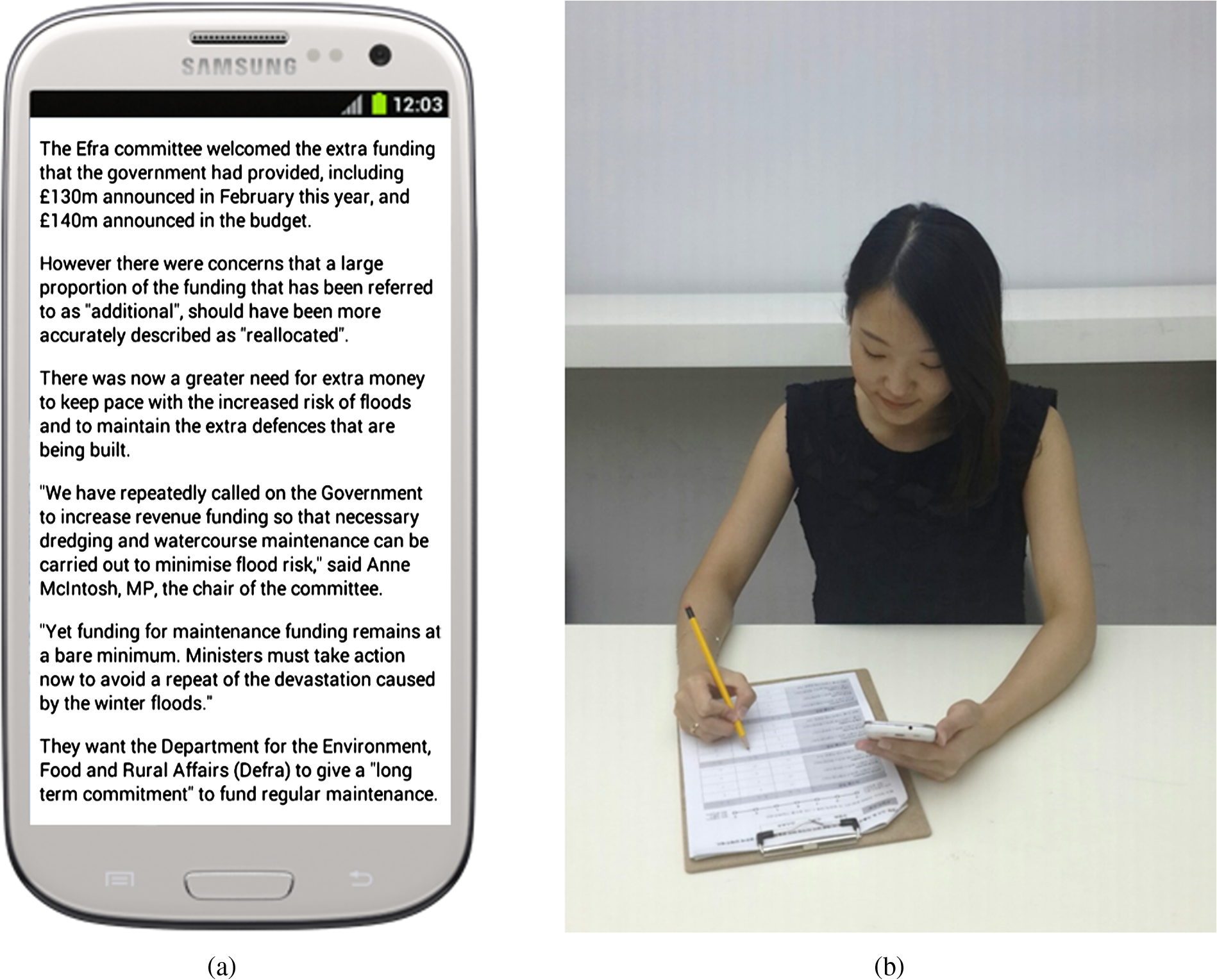
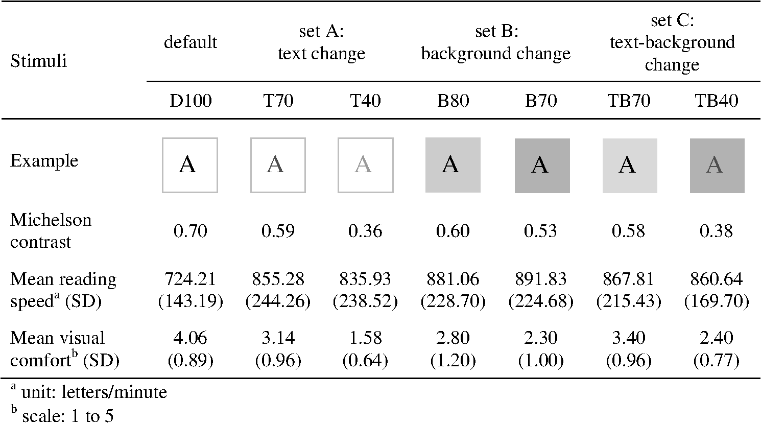
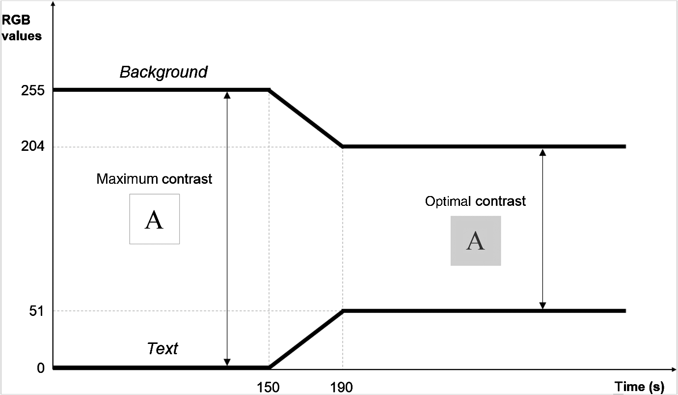
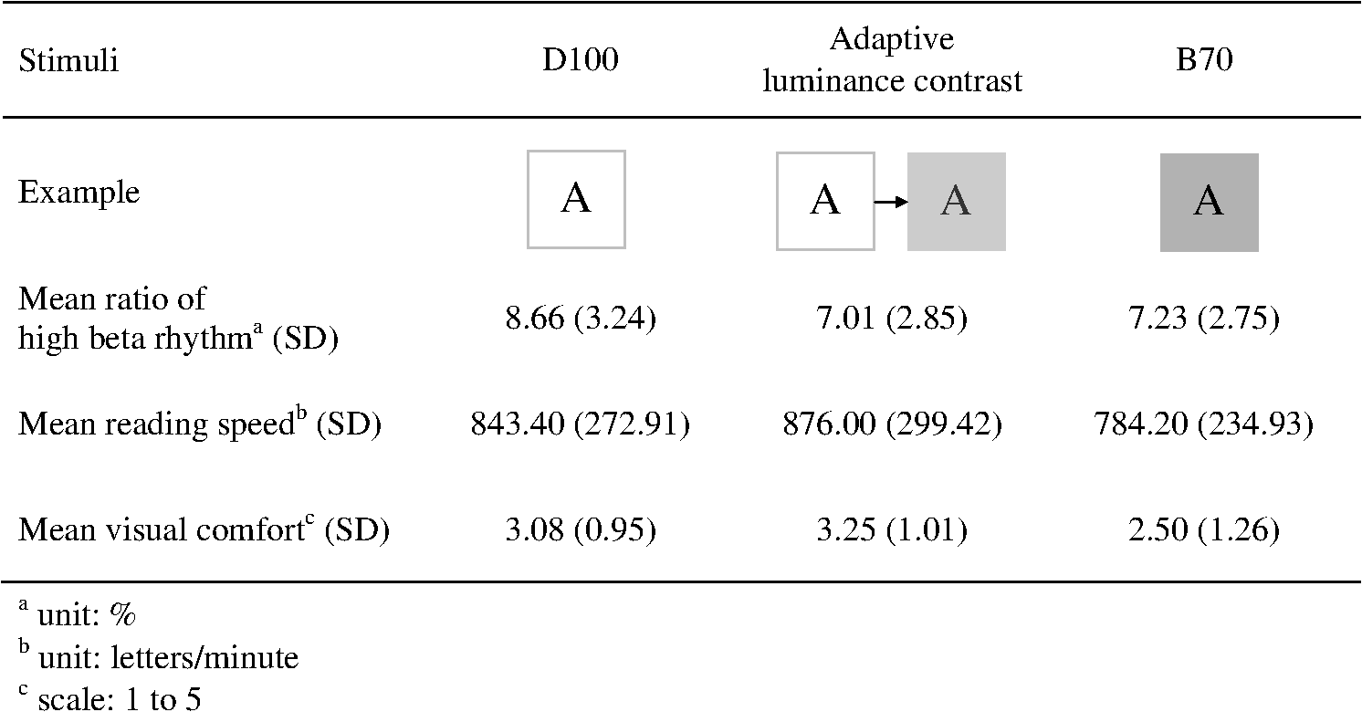
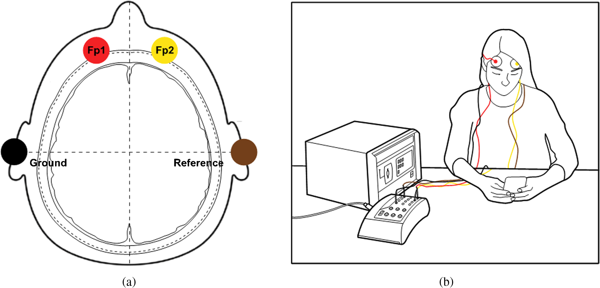
1.IntroductionReading is one of the most important ways of communicating information. Problems related to legibility and readability have been studied for decades, mainly focusing on printed texts.1,2 However, as portable digital devices have become more accessible in everyday life,3 paper reading materials are being replaced with visual display terminals. Compared with printed texts which are seen through recognizing reflected lights, digital displays are a self-illuminant surface which emit light, resulting in more stress to the human eye.4,5 Hence, recent studies have accordingly devoted more attention to discovering the appropriate luminance on displays such as smartphones, e-books, and tablet PCs.4,6–8 The studies suggest particular luminances to prevent visual fatigue caused by displaying materials, but these suggestions lack careful consideration of the human visual system. People do not perceive luminance in absolute terms but rather they see luminance contrast.9,10 When reading on a smartphone display, the luminance contrast between the text and background has a great influence on visual perception. People prefer a higher luminance contrast as confirmed by previous studies, however, a lower luminance contrast does not disturb visual perception.11 According to Knoblauch et al., a large contrast in luminance increases visual recognition,12 whereas the continuity of the contrast has contributed to visual discomfort.5 Therefore, human vision provides a time-dependent adaptation11,13,14 to reduce visual fatigue. Some studies have also revealed that the maximum luminance contrast between text and background is inadequate for reading a display because an excessively high contrast leads to visual stress.6,12,15 Consequently, it is reasonable that the luminance contrast of smartphone displays changes with the passage of time in the light of visual adaptation.16,17 In this regard, this study attempts to develop a model for the adaptive luminance contrast, which gradually changes the luminance contrast between the text and background over time to improve reading performance and visual comfort in parallel, particularly for reading on smartphone displays. Furthermore, the effectiveness of the proposed model will be verified through a validation test. Across the whole course of the study, it is hypothesized that a gradual decrease of luminance contrast would facilitate comfortable and efficient reading. 2.Experiment I: User Test for Developing the Adaptive Luminance Contrast2.1.ObjectiveThe user test in Experiment I is aimed investigating the ideal luminance contrast between the text and background for reading on smartphone display, as well as developing a model of the adaptive luminance contrast which enhances both reading performance and visual comfort. 2.2.StimuliPrior to the experiment, stimuli for the user test were prepared. In creating luminance contrast, three approaches were employed: first, set A was text change—the text color changes from black to white as time passes while the background color is fixed as white; second, set B was background change—the text color remains black and the background shifts from white to black; and lastly, set C was text-background change—the text gradually changes from black to white, whereas the background color changes from white to black at the same rate. Next, given that the maximum luminance contrast between the text and background is 100 and the minimum luminance contrast is 0, each set was equally divided into 10 levels of luminance contrast. After combining the three overlapped stimuli from each set, black text on white background into one stimulus (hereinafter cited as default), there were a total of 28 luminance contrasts. The luminance was measured using a spectroradiometer (Konica Minolta CS-2000) under the same luminous environment during the experiment. Moreover, the display RGB input and Michelson contrast10 of each stimulus were listed in Fig. 1. Among the 28 stimuli, some could cause negative perception in terms of both cognitive comfort and esthetics due to a very small luminance contrast between the text and background. Hence, before the user test, subjects were asked to indicate the stimulus with the smallest but still acceptable luminance contrast for each set. Based on the responses, the minimum luminance contrasts for sets A, B, and C were found to be T40, B70, and TB40, respectively (see Fig. 1). In addition, an intermediate stimulus was inserted for each set—T70, B80, and TB70—and seven stimuli were selected for the reading task. 2.3.Experimental SetupA total of 50 subjects composed of 26 males and 24 females took part in the user test. The average age of the subjects was 23.18 years with a standard deviation of 1.99 years. Each of them had normal vision or corrected to normal vision. The stimuli were displayed on a smartphone (Samsung Galaxy S3) with a 4.8 inch screen, and the backlight luminance of the display was fixed at . At the subject’s desk, the measure of the correlated color temperature was 6300 K, and the illuminance was 600 lx. During the test, the subjects maintained a typical viewing distance from the smartphone display of 30 cm.18 The experimental setup is schematically shown in Fig. 2. 2.4.MethodSubjects were instructed to read 10 pages (approximately 2500 letters) of a newspaper article at a natural speed on a smartphone under the seven selected stimuli in a random order. They had a 1-min break before turning to the next reading sessions. Each article consisted of different content but the same level of difficulty to circumvent the influence of content type. In the same way as related studies for examining the effect of displays,19–22 this study evaluated both the reading performance and visual comfort by conducting two kinds of tasks. First, to evaluate reading performance, the subjects’ reading speeds for each page were measured under the seven selected stimuli on the assumption that reading speed is faster under an adequate reading environment. Next, to assess visual comfort, subjects answered a self-report questionnaire to evaluate their subjective visual comfort to luminance contrast for the 28 stimuli by using a five-point Likert scale23 (1 point: very uncomfortable; 5 points: very comfortable). For example, they gave a score of five points if they felt comfortable with the given stimulus. 2.5.Results and AnalysisThere was a large difference between the reading speeds of each page. It became faster as the subject turned the pages. The reading speed noticeably increased from page 7 or about 135 s after the subject began reading (average reading speed of the 1 to 6 pages: ; 7 to 10 pages: ), and the increased speed was thereafter maintained. This means that subjects generally start focusing attention on reading around 135 s after they begin. From this, the starting time of the change in luminance contrast could be determined given that reading speed does not change after the subject concentrates more intensively on the reading. Comparing the reading speed of each set, two stimuli in set B (B80 and B70) recorded the highest speed and stimuli in set C (TB70 and TB40) followed closely, whereas a markedly lower speed was observed for the default stimulus (D100), as shown in Fig. 3. In other words, the stimuli in two high-ranked sets have a better reading performance than the others. The results were contrary to earlier research results stating that reading speed is fastest when the luminance contrast between text and background is maximal.24,25 In terms of visual comfort, subjects felt most comfortable under the default stimulus (D100). Comparing visual comfort among two stimuli in same set and the default (D100, T70, and T40; D100, B80, and B70; D100, TB70, and TB40), visual comfort decreased rapidly in every set when the luminance contrast became smaller. In comparison with each set under same level of luminance contrast (intermediate and minimum luminance contrast), respectively, the stimuli in set C (TB70 and TB40)—the luminance of text and background change simultaneously—earned the highest comfort score in both times. Furthermore, in set C, the degree of visual comfort decrease that depended on the decline of luminance contrast was relatively small in sets A and B. On the contrary, B80 included in set B received a very low comfort score even at the intermediate level of luminance contrast. From the results, it is found that subjects do not feel visual comfort under the stimuli in set B despite the fact that those offered the best reading performance; as such, it is inappropriate to select set B as the changing pattern of luminance contrast. 2.6.Development of Adaptive Luminance ContrastBy using the results of the user test, an empirical basis for designing the adaptive luminance contrast was partially collected. It is appropriate that the luminance contrast starts from maximum contrast (corresponding with the default) and gradually decreases in the text and background at the same rate, as in set C. Accordingly, the recognition point of change in luminance contrast was investigated in order to confirm the final luminance contrast and to derive the adaptive model. A video clip with changing luminance contrast from maximum (0.70 in the experiment) to 0 for 20 s was created for set C, and subjects were asked to stop the video clip when they noticed a change in the luminance contrast on the display. As a result, it was found that the average recognition point was a luminance contrast of 0.52 in the experiment (luminance of text: ; luminance of background: ), namely the RGB values of the text are 51 and those of the background are 204; this remained the constant even though the changing time varied. Luminance decrease should occur within the imperceptible range because esthetic satisfaction of the display decreases if users notice the change. Through a series of user tests, a time-dependent adaptive model of luminance contrast for a smartphone display was developed as shown in Fig. 4. The luminance contrast between the text and background starts from a maximum where RGB values of the text are 0 and those of background are 255, because a large contrast helps users to concentrate on reading at first. They also feel visual comfort for these values. However, users suffer from visual fatigue if it lasts a long time; hence, the luminance contrast begins to change 150 s later as they generally focused more intensively on reading the content at about that time. In addition, by taking into account both reading performance and visual comfort, set C where the luminance of the text and background change at the same rate was selected as a changing pattern. The final luminance contrast was determined as 0.52, the RGB values of the text are 51 and the background are 204 considering the average recognition point of change. In order to avoid users becoming aware of the change because they are bothered with the changing luminance, the luminance contrast between the text and background shifts slowly for 40 s. 3.Experiment II: Validation Test for Verifying the Adaptive Luminance Contrast3.1.ObjectiveThe purpose of the second experiment of the study is to apply the adaptive luminance contrast in an actual usage environment. Moreover, it attempts to verify the effectiveness and applicability of the proposed adaptive model through a series of multidimensional validation tests by evaluating reading performance and visual comfort. 3.2.StimuliBesides the adaptive luminance contrast, two additional luminance stimuli were prepared to compare the effectiveness with the developed model. The first stimulus was black text on a white background which corresponds with D100 in Experiment I, the luminance contrast of the current displays on general smartphones. Another stimulus was B70, which was assessed as the best reading performance from the previous user test. Thus, a total of three stimuli were comprised for the validation test as shown in Fig. 5. 3.3.Experimental Setup and MethodTwelve students, consisting of six males and six females, served as subjects for the experiment. Their average age was 24.83 years with a standard deviation of 1.46 years. The experimental environment was identical with that of the user test in Experiment I. Subjects were asked to read a newspaper article for 5 min using a smartphone under the three luminance stimuli in a random order. As in the previous test, both reading performance and visual comfort were evaluated to compare the effectiveness of the stimuli. In addition to measuring the subjects’ reading speeds and their self-reports on visual comfort, a brainwave analysis was carried out using an electroencephalogram (EEG) while subjects read articles. A total of four electrodes, two channels on the frontal lobe (, ), ground, and reference electrodes, were attached to the subject’s head to capture the EEG signal, as shown in Fig. 6. Brainwave data were measured for 5 min and 10 s, and the first 10 s of the recorded data were deleted to improve the accuracy of the results. The collected data were converted by 256-Hz sampling frequency and 12-bit analog-digital converter, then saved through Telescan, the analysis program developed by Laxtha Inc. After that, the relative ratio of the high beta rhythm (20–30 Hz)26 to the entire range (3.5–50 Hz) was then calculated using the data. A high beta rhythm is generated when people feel stress and anxiety;27 thus, a low ratio of high beta rhythm indicates that the subject is in a comfortable state during reading. Each subject’s data was obtained by calculating the mean ratio of two channels. For example, if the ratios of high beta rhythm from and were 7.11% and 6.98%, respectively, the mean value of the two data, namely 7.05%, was the final data for the subject. The relative ratio is used for brainwave analysis rather than absolute power since brainwave powers have wide variations in different people. 3.4.Results and AnalysisThrough the results of the validation test, the effectiveness of the three stimuli was compared in various aspects, as shown in Fig. 5. The ratio of the high beta rhythm, which indicates the degree of stress during reading, was much lower when viewing the adaptive luminance contrast than when reading on D100, which corresponds with the luminance contrast of current smartphone displays. While reading under the developed adaptive model, the emission of high beta rhythm was about 7% and was even lower than that while reading books on paper28 or working cognitive performance tests.29,30 Moreover, the result of the self-report questionnaire on visual comfort also rated highest in the adaptive luminance contrast among the three luminance stimuli. That is, users feel most comfortable with the display applying the proposed model. On the contrary, B70 was reported as the least comfortable stimulus, because the dark background gave subjects an unpleasant impression, consistent with the user test in Experiment I. In respect to reading performance, subjects read the article most quickly under the adaptive luminance contrast, followed by D100 and B70. This demonstrates that the developed adaptive model improves the readability of typography. To sum up, the adaptive luminance contrast was the most outstanding for both reading performance and visual comfort, and it confirmed that a gradual decrease in luminance contrast provides an adequate reading environment on smartphone displays. 4.DiscussionFrom the experiments, a new way has been presented for implementing the optimal luminance contrast between text and background. Applying the adaptive luminance contrast on a smartphone display affords two major advantages. First, it enables the user to read content in a comfortable and efficient state for a long period of time by maintaining the balance between reading performance and visual comfort. Second, the adaptive model requires lower energy consumption compared to current smartphone displays; therefore, it has a potential for saving battery power. According to Chang et al., users even accept some color changes to extend the battery life, as long as they can still recognize the displayed contents.31 In this aspect, this study is remarkable for both improving users’ comfort and extending battery life at the same time. The aforementioned two advantages are the benefits of brightness control discovered from an earlier study.32 This study provides some opportunities for further research. Above all, supplementary research should be conducted to examine the effect of display backlight and ambient illuminance on the adaptive luminance contrast, because visual performance depends on both contrast and luminance.7 Previous studies discovered that ambient illuminance plays an important role in visual perception and preference of display.33–37 Reading is also influenced by backlight luminance.38 Hence, it has to be determined whether or not the results of this study are relevant on displays with different backlight luminances or under various levels of ambient illuminance. It might also be meaningful to compare the distinction between optimal luminance contrasts depending on age group, and to suggest an appropriate luminance solution fitting each group because the visual ability of humans varies considerably with age.39 Such additional research will increase the value and relevancy of the study. 5.ConclusionIn this study, two phases of experiments were conducted to examine the optimal luminance contrast for comfortable and efficient smartphone use and an adaptive luminance contrast model that supports a time-dependent adaptive process of the human visual system was developed. The model gradually changes the luminance contrast between text and background on a smartphone display as time passes such that the user is not aware of the change. The effectiveness of the proposed adaptive model was verified through a validation test. It is hoped that this study will extend the opportunities for prolonged use for diverse kinds of visual display terminals including smartphones, tablet PCs, and e-books. ReferencesD. Hodge,
“Legibility of a uniform-strokewidth alphabet: II. Some factors affecting the legibility of words,”
J. Eng. Psychol., 2
(2), 55
–67
(1963). Google Scholar
G. E. LeggeG. S. RubinA. Luebker,
“Psychophysics of reading—V. The role of contrast in normal vision,”
Vis. Res., 27
(7), 1165
–1177
(1987). http://dx.doi.org/10.1016/0042-6989(87)90028-9 VISRAM 0042-6989 Google Scholar
X. Chenet al.,
“How is energy consumed in smartphone display applications?,”
in Proc. 14th Workshop on Mobile Computing Systems and Applications,
3
(2013). Google Scholar
J. ChenW. CrantonM. Fihn, Handbook of Visual Display Technology, Springer, London, UK
(2012). Google Scholar
S. Yanget al.,
“Study of preferred background luminance in watching computer screen in children,”
Chin. Med. J., 127
(11), 2073
–2077
(2014). CMJODS 0366-6999 Google Scholar
S.-J. LeeJ.-W. Kim,
“An experimental study on the impacts of luminance contrast upon readability in VDT environments,”
J. Ergon. Soc. Korea, 26
(2), 21
–33
(2007). http://dx.doi.org/10.5143/JESK.2007.26.2.021 2093-8462 Google Scholar
M. Menozziet al.,
“CRT versus LCD: effects of refresh rate, display technology and background luminance in visual performance,”
Displays, 22
(3), 79
–85
(2001). http://dx.doi.org/10.1016/S0141-9382(01)00054-3 DISPDP 0141-9382 Google Scholar
M. Z. Ramadan,
“Evaluating college students’ performance of Arabic typeface style, font size, page layout and foreground/background color combinations of e-book materials,”
J. King Saud Univ.- Eng. Sci., 23
(2), 89
–100
(2011). http://dx.doi.org/10.1016/j.jksues.2011.03.005 1018-3639 Google Scholar
H.-P. D. Company,
“Contrast ratio-what does it really mean?,”
(2014) http://h10010.www1.hp.com/wwpc/pscmisc/vac/us/product_pdfs/Monitors_Contrast_ratio_WP_Aug08.pdf June ). 2014). Google Scholar
P. R. Boyce, Human Factors in Lighting, CRC Press, Florida
(2003). Google Scholar
S. N. Pattanaiket al.,
“Time-dependent visual adaptation for fast realistic image display,”
in Proc. 27th Annual Conf. on Computer Graphics and Interactive Techniques,
47
–54
(2000). Google Scholar
K. KnoblauchA. ArditiJ. Szlyka,
“Effects of chromatic and luminance contrast on reading,”
J. Opt. Soc. Am. A, 8
(2), 428
–439
(1991). http://dx.doi.org/10.1364/JOSAA.8.000428 JOAOD6 0740-3232 Google Scholar
E. H. Adelson,
“Saturation and adaptation in the rod system,”
Vis. Res., 22
(10), 1299
–1312
(1982). http://dx.doi.org/10.1016/0042-6989(82)90143-2 VISRAM 0042-6989 Google Scholar
P. LeddaL. P. SantosA. Chalmers,
“A local model of eye adaptation for high dynamic range images,”
in Proc. 3rd Int. Conf. on Computer Graphics, Virtual Reality, Visualisation and Interaction in Africa,
151
–160
(2004). Google Scholar
A. HillL. Scharff,
“Readability of websites with various foreground/background color combinations, font types and word styles,”
in Proc. 11th Natl. Conf. on Undergraduate Research,
742
–746
(1997). Google Scholar
J. BenyaP. Schwartz, Advanced Lighting Guidelines, New Buildings Institute, Washington
(2001). Google Scholar
N. NaJ. JangH.-J. Suk,
“Dynamics of backlight luminance for using smartphone in dark environment,”
Proc. SPIE, 9014 90140I
(2014). http://dx.doi.org/10.1117/12.2038842 PSISDG 0277-786X Google Scholar
L. Spenceret al.,
“P. 134L: late news poster: resolution limits for smartphones—video playback,”
in Proc. SID Symposium Digest of Technical Papers,
1099
–1102
(2013). Google Scholar
M. Matthews,
“The influence of colour on CRT reading performance and subjective comfort under operational conditions,”
Appl. Ergon., 18
(4), 323
–328
(1987). http://dx.doi.org/10.1016/0003-6870(87)90140-2 AERGBW 0003-6870 Google Scholar
J. E. SheedyM. McCarthy,
“Reading performance and visual comfort with scale to grey compared with black-and-white scanned print,”
Displays, 15
(1), 27
–30
(1994). http://dx.doi.org/10.1016/0141-9382(94)90040-X DISPDP 0141-9382 Google Scholar
K.-K. ShiehC.-C. Lin,
“Effects of screen type, ambient illumination, and color combination on VDT visual performance and subjective preference,”
Int. J. Indus. Ergon., 26
(5), 527
–536
(2000). http://dx.doi.org/10.1016/S0169-8141(00)00025-1 0169-8141 Google Scholar
J. A. VeitchS. L. McColl,
“Modulation of fluorescent light: Flicker rate and light source effects on visual performance and visual comfort,”
Lighting Res. Technol., 27
(4), 243
–256
(1995). http://dx.doi.org/10.1177/14771535950270040301 LRTEA9 0024-3426 Google Scholar
R. LikertS. RoslowG. Murphy,
“A simple and reliable method of scoring the Thurstone attitude scales,”
J. Soc. Psychol., 5
(2), 228
–238
(1934). http://dx.doi.org/10.1080/00224545.1934.9919450 0022-4545 Google Scholar
M. A. NelsonR. L. Halberg,
“Visual contrast sensitivity functions obtained with colored and achromatic gratings,”
Hum. Factors, 21
(2), 225
–228
(1979). http://dx.doi.org/10.1177/001872087902100210 Google Scholar
G. E. LeggeG. S. Rubin,
“Psychophysics of reading. IV. Wavelength effects in normal and low vision,”
J. Opt. Soc. Am. A, 3
(1), 40
–51
(1986). http://dx.doi.org/10.1364/JOSAA.3.000040 JOAOD6 0740-3232 Google Scholar
X. J. CaroE. F. Winter,
“EEG biofeedback treatment improves certain attention and somatic symptoms in fibromyalgia: a pilot study,”
Appl. Psychophysiol. Biofeedback, 36
(3), 193
–200
(2011). http://dx.doi.org/10.1007/s10484-011-9159-9 1090-0586 Google Scholar
Y. J. Lee,
“Reactions to stimulation of motion graphics: based on EEG experiments,”
J. Digit. Design, 13
(4), 311
–321
(2013). 1598-2319 Google Scholar
H. W. LinM. H. Hsu,
“Exploring the mystery of literary reading: a psychophysiological perspective,”
Int. J. Soc. Sci. Humanity, 2
(6), 459
–461
(2012). http://dx.doi.org/10.7763/IJSSH.2012.V2.146 2010-3646 Google Scholar
B. J. Ko,
“Changes in activation of brain wave, mental power and self-regulatory ability from application of brain education program for youth,”
(2010). Google Scholar
E. S. LeeH. J. Suk,
“The emotional response to lighting hue focusing on relaxation and attention,”
J. Korean Soc. Design Sci., 25
(2), 27
–39
(2012). 1226-8046 Google Scholar
N. ChangI. ChoiH. Shim,
“DLS: dynamic backlight luminance scaling of liquid crystal display,”
IEEE Trans. Very Large Scale Integr. (VLSI) Syst., 12
(8), 837
–846
(2004). http://dx.doi.org/10.1109/TVLSI.2004.831472 IEVSE9 1063-8210 Google Scholar
T.-Y. Maet al.,
“Automatic brightness control of the handheld device display with low illumination,”
in Proc. 2012 IEEE Int. Conf. on Computer Science and Automation Engineering (CSAE),
382
–385
(2012). Google Scholar
S. Y. Choiet al.,
“Changes in colour appearance of a large display in various surround ambient conditions,”
Color Res Appl., 35
(3), 200
–212
(2010). http://dx.doi.org/10.1002/col.v35:3 CREADU 0361-2317 Google Scholar
K. DevlinA. ChalmersE. Reinhard,
“Visual calibration and correction for ambient illumination,”
ACM Trans. Appl. Percept., 3
(4), 429
–452
(2006). http://dx.doi.org/10.1145/1190036 1544-3558 Google Scholar
R. MerrifieldL. D. Silverstein,
“The ABC’s of automatic brightness control,”
in Society for Information Display International Symposium Digest of Technical Papers,
178
–181
(1988). Google Scholar
A. G. Rempelet al.,
“Video viewing preferences for HDR displays under varying ambient illumination,”
in Proc. 6th Symp. on Applied Perception in Graphics and Visualization,
45
–52
(2009). Google Scholar
S. Swinkelset al.,
“66.1: ambient light control for mobile displays,”
in Proc. SID Symposium Digest of Technical Papers,
1006
–1009
(2008). Google Scholar
J. H. KrantzL. D. SilversteinY.-Y. Yeh,
“Visibility of transmissive liquid crystal displays under dynamic lighting conditions,”
Hum. Factors, 34
(5), 615
–632
(1992). http://dx.doi.org/10.1177/001872089203400508 Google Scholar
Y. InoueY. Akitsuki,
“The optimal illuminance for reading: effects of age and visual acuity on legibility and brightness,”
J. Light Vis. Environ., 22
(1), 23
–33
(1998). http://dx.doi.org/10.2150/jlve.22.1_23 JLEVDQ 0387-8805 Google Scholar
BiographyNooree Na is a PhD candidate at KAIST in the Department of Industrial Design. She received her BS and MS degrees in industrial design from KAIST in 2011 and 2013, respectively. Her current research interests include psychophysics and visual ergonomics on display luminance. Hyeon-Jeong Suk received her BS and MS degrees in industrial design from KAIST, Republic of Korea, and her PhD degree in psychology from the University of Mannheim, Germany. Currently, she is an associate professor of KAIST leading a laboratory for color and emotion studies and an editor-in-chief of the Journal of Korean Society for Emotion and Sensitivity. Her research interests include color psychology and emotional design. |